Plotly, F# and Response of India to Covid Crisis
Learn how to visualize India's COVID-19 response using Plotly and F#. Interactive notebook tutorial with real data analysis.
Recently I got the chance to work with the Plotly team. I was helping them set up the F# documentation pipeline. There was less of F# but more of hacking around Jupyter notebooks and their plugins.
But I like the Plotly library and its cross-platform approach. They are available for almost all languages. Plotly Dash is kind of another next-level beast, again available for all the languages.
Here obviously we are going to talk about only F#. This post is part of the FsAdvent calendar of 2021. Thanks Sergey Tihon for arranging this and giving me the chance.
Plotly, as the name suggests, is mostly for data scientists, so it is very notebook friendly. Combined with Dotnet interactive, it is a force to be reckoned with.
In the COVID era, there would be nothing better than analyzing COVID data. Here we will be looking at the simple use of the Plotly library to check out India's response to the COVID crisis.
Let's first set up VS Code. If you have the latest Dotnet installed, then the only thing you need to do is create a notebook file. Just create an analysis.ipynb file in any folder and open it in VS Code.
It will ask how you like to run it; select Dotnet interactive and F# as the language. Then you are good to go.
Here is the code to add the necessary libraries in the notebook.
#r "nuget: Plotly.NET,  2.0.0-preview.16"
#r "nuget: newtonsoft.json"
#r "nuget: Plotly.NET.Interactive,  2.0.0-preview.16"
#r "nuget: FSharp.Data"
#r "nuget: Deedle"

open Plotly.NET
open FSharp.Data
I will be using FSharp.Data library to parse and process data using F# type provider for JSON and CSV.
[<Literal>]
let ApiUrl = "https://api.covid19tracker.in/data/csv/latest/case_time_series.csv"

type CoVidData = CsvProvider<ApiUrl>

let covidData = CoVidData.Load(ApiUrl)

let covidPlotData = covidData.Rows |> Seq.toArray |> Array.map(fun x -> (x.Date_YMD, x.``Daily Confirmed``.GetValueOrDefault(0))) |> Array.toSeq

Chart.Scatter(covidPlotData, StyleParam.Mode.Lines_Markers)
Here's how it looks once the cell is executed.
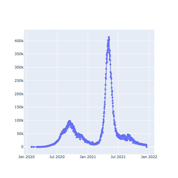
As you can see, there are three waves in COVID cases. The second wave was the worst of all.
Now, let's see how vaccination is being done on a weekly basis.
[<Literal>]
let JSONPath = "./dashboard_export.json"

type VaccinationData = JsonProvider<JSONPath>

let vaccinationData = VaccinationData.Load(JSONPath)

let vaccinationPlotData = vaccinationData.WeeklyVaccination |> Array.map(fun x -> (x.Label, x.Total / 100))

Chart.Scatter(vaccinationPlotData, StyleParam.Mode.Lines_Markers)
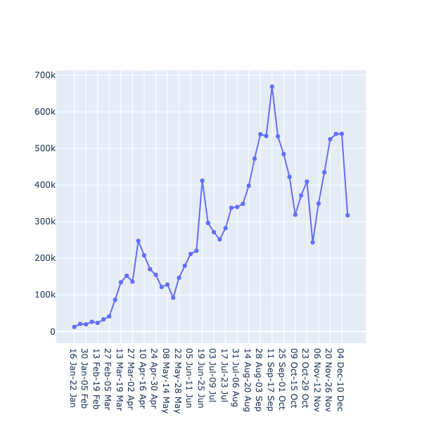
You can find the dashboard JSON file here or take the latest from https://dashboard.cowin.gov.in/.
Here's how the result looks when the cell is executed.
There are too many questions about vaccination, just like there are questions about the earth being flat. Let's answer the first question and leave the second one for next time.
Here I am filtering data from the date vaccination started and then grouping COVID cases based on the week, just to make both data sets equivalent. As the vaccination numbers were too high compared to COVID cases, I'm dividing it by 100 just to make the graph more readable.
let confirmedCasesAfterVaccinationStarted =
    covidData.Rows
            |> Seq.toArray
            |> Array.map(fun x ->  (x.Date_YMD, x.``Daily Confirmed``.GetValueOrDefault(0) ) )
            |> Array.filter(fun (x,_) -> x > new DateTime(2021,01,16))
let confirmedCasesByWeeks =
    vaccinationData.WeeklyVaccination
            |> Array.map(fun x -> (x.Label, x.Startdate.DateTime, x.Enddate.DateTime))
            |> Array.map(fun (label ,sd, ed) -> (label, confirmedCasesAfterVaccinationStarted
                                                    |> Array.filter(fun (y,_) -> (sd < y && y < ed))
                                                    |> Array.sumBy(fun (_,y) -> y)))

[
        Chart.Line(confirmedCasesByWeeks)
        |> Chart.withTraceName(Name="Confirm Cases by Week")
        |> Chart.withLineStyle(Width=2.0, Dash=StyleParam.DrawingStyle.Solid)

        Chart.Line(vaccinationPlotData)
        |> Chart.withTraceName(Name="Vaccination")
        |> Chart.withLineStyle(Width=2.0, Dash=StyleParam.DrawingStyle.Solid)
]
|> Chart.combine
|> Chart.withXAxisStyle("Week")
Here's how it looks once the cell is executed.
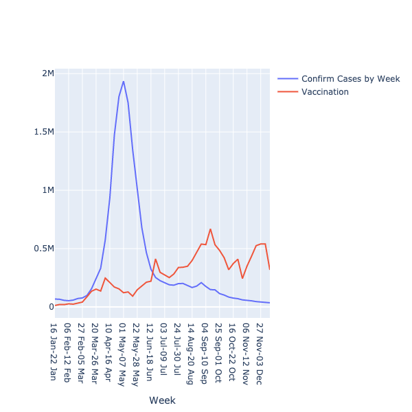
As you can see in the graph, vaccination is keeping the COVID numbers down as much as possible. One can surely conclude that vaccines work and in the case of India, both vaccines are indigenous.
Do check out this wonderful library and if you haven't, please take the jab. Happy coding.
Frequently Asked Questions
Plotly is a cross-platform graphing library available for nearly all programming languages, making it highly versatile for data scientists and analysts. It's particularly notebook-friendly and when combined with Dotnet Interactive, it becomes a powerful tool for creating interactive visualizations and dashboards without extensive setup.
Create a `.ipynb` notebook file in VS Code, select Dotnet Interactive as your runtime, and choose F# as the language. Then add the necessary NuGet packages using `#r` directives, including Plotly.NET, Plotly.NET.Interactive, FSharp.Data, and Deedle to get started with data visualization.
FSharp.Data is a library that provides type providers for parsing JSON and CSV data, allowing you to work with external data sources directly in F#. In this example, it enables seamless loading and processing of COVID data from APIs and local files with full type safety.
The analysis of India's case time series data showed three distinct waves of COVID-19 infections, with the second wave being the most severe. The visualization clearly displayed the pattern of daily confirmed cases over time, providing insights into the country's pandemic response.
Yes, Plotly Dash is an advanced framework built on top of Plotly that is available for all programming languages, including F#. It allows you to create interactive web-based dashboards and applications with more complex functionality than basic Plotly charts.